Video calls have you worried about your walls? Designers Zoom in to reveal what works best from behind the scenes.
By Alexandria Abramian
As home has transformed into a multi-hyphenate live/work/learn/workout space overnight, video calls have suddenly put our abodes under the spotlight. And with it a new design question has emerged: Where will I shine best at home? Here designers delve into the background to frame your ultimate video setting.
Erica Bryen
Erica Bryen Design | @ericabryendesign

If you aim your video call to a background with trendy elements, it’s going to become the star of the call—not you. I suggest people find a background that is timeless and speaks in a quieter way to complement, not compete with you. This custom-made metal art piece made by Chris McLaughlin adds this cool, unexpected 3D element to the room. If you move a table a few feet in front of it for video calls, it gives this modern and fashion-forward vibe, with a touch of glamour. But it does so in a quiet way, without stealing the show.
Janet McCulley
McCulley Design Lab | @mcculleydesignlab

Researchers have found that we’re more productive when components of Biophilic Design (natural elements) are present, so why not integrate the great outdoors into your background?
Point of view: You may want to impress a client and sit poolside to best showcase your beautiful garden or ocean view, or if you’re meeting with internal team members who might not appreciate something so showy, you can’t go wrong with a beautiful backdrop of textural greenery or a hedge (see Elton John’s performance at One World Together At Home).
Insider tip: No matter how beautiful your outdoor background might be, noisy neighbors, leaf blowers, barking dogs, or too much backlighting can be a deal-breaker. If you head inside, sit in front of anything other than a blank wall that creates mood, whether it is a colorful piece of art, indoor plants, or a stone wall.
Robin Strickler
Founder, Design Works | @designworkshome

If you want to exude a sense of someone who is powerful, isn’t afraid to take risks, and who also appreciates great design, a bold, graphic wall will instantly speak confidence and stature. I think that’s exactly what this wall covering, Coffered Wood Beach House by Phillip Jeffries (above), achieves.
Insider tip: If you’re going for big and bold, don’t dilute it with distractions. In this room, opt for a minimal desk lamp—maybe in brass to complement the other desk accessories. The idea is that you don’t want to take your eyes away from the main focus: the fabulous wallpaper and the visual contrast of the artwork to the left of the desk.
Jamie Adler
Circa Wallcovering | @circawallcovering

I think those virtual backgrounds were fun the first few weeks, but later they became distracting, and for designers, this is a kind of cheating. This is such an opportunity to show your personal style and environment and there are probably more areas of your home than you think that can make great background vignettes. One of our wall coverings, Rock On by Kimberly McDonald (above), conveys a bold sense of confidence, a strong sense of style, and a not-so-subtle message for a glamorous Zoom room.
Insider Tips: Test as many angles as possible before you actually join the conference. Even pivoting 15 degrees can completely change the way you and everything behind you looks. Also, coordinate what you are wearing with the tones and palette of the background for a cohesive visual.
Susan Hornbeak-Ortiz
Shine by S.H.O. | @shinebysho

Artwork within the Zoom frame is more interesting than a blank wall or the weird shots of bookcases that seem to be on the news media lately. I personally love over-scaled artwork.
Insider Tips: Watch out for anything too personal, provocative, or super colorful—either one could work against the purpose of the client focusing on the meeting at hand and be potentially distracting. During these difficult times, I think leaning towards art that is more calming is a plus. I also think displaying an art piece that can start up a conversation can be a great tool as it can potentially be a talking point or ice-breaker (depending on the nature of the call). Give yourself 15-20 minutes before the call to adjust the camera with you in the frame and play around. If the art is too strong, you will need to make it possibly a “partial” frame—maybe you are one-third and the art is two-thirds or vice versa—this will give a hint of the art without overpowering you.


![🎨✨ Color meets creativity at the coast ✨🎨
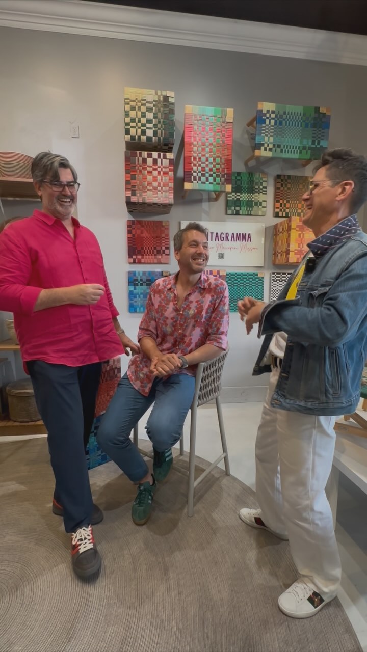
Join Bloor Door Magazine and Tidelli Outdoor Living @tidellioutdoor for an unforgettable evening with Francesco Maccapani Missoni @fmaccapani , the visionary behind the Pentagramma Collection.
📍 Tidelli Outdoor Living - Orange County
7876 East Coast Highway Newport Beach, CA 92657
🗓 Wednesday, May 21 | 🕕 6–7:30 PM (Doors at 5:30)
Expect:
🌈 A deep dive into the art of combining color
🎤 Live talk + Q&A with Francesco
👀 Behind-the-scenes of the Pentagramma Collection
🍸 Light bites + good vibes
Come get inspired by bold rope hues, timeless design, and Italian soul.
🎟 RSVP now → [link in bio]
#Missoni #TidelliOutdoorLiving #BloorDoorMagazine #DesignEvent #FrancescoMissoni #ColorStory #NewportBeachEvents #InteriorInspo #DesignTalks](https://bluedoormagazine.com/wp-content/uploads/2024/03/499443917_18279427363301802_778893880365426415_n.jpg)
